Friday, 29 November 2013
Wednesday, 27 November 2013
Front Cover - Work In Progress
A few adjustments here and there e.g. moved the skyline so that it weren't clashing with the spike bubble on right hand side. My text was done on illustrator so I began changing it/copying it in to photoshop format so that it makes it easier to tweak.
Tuesday, 26 November 2013
Front Cover - work in progress
Carried on working on my front cover, added on coverlines and a skyline. Used a specific colour scheme, the dark colour was picked up from my models jacket in order for the cover to flow nicely. My models pose is representing power and strength.
Monday, 25 November 2013
Front Cover - the start
I have made my masthead on illustrator and I have added it onto my front cover image. After adding my ruler guidlines I have realised I will have to move my masthead higher up and further from the edge to fill space and make it more spread, possibly also move and zoom into my cover image for a better close up.
Wednesday, 20 November 2013
Contents - layout plan
Carried on working on contents page and decided to change my layout..first page will use a full image of cover star and second page will contain the other cover line/features.
Monday, 18 November 2013
Sunday, 17 November 2013
Photography - Set Up
This is my studio set up for my photo shoots. Soft boxes on either side on star to give an equal balance of light on each side of face.
Thursday, 14 November 2013
Monday, 11 November 2013
Photography prep
Here are my notes from my photography studio induction. Learning about the camera, lightening and set up.
Thursday, 7 November 2013
Working with illustrator!

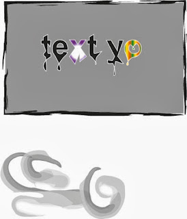
Today I worked with illustrator which is the program I will use on my final magazine for the masthead and some text. As it was my first time ever using illustrator, I had some difficulty but as I went on it became much easier to work with. Here is an example of some tools I tried out. I started off with a basic text box that I simply changed the colour of fill and typed in my text. I put a white outline on my text so it lifts off the background a bit more. When you use the direct tool and double click on text you can then change the shape of letters, this is where I made my text drip by stretching it and then flipping it. I also found out how to put a gradient colour effect on text which I did to the X and O. My text box looked plain therefore I found a way to put all kinds of borders on, I used the paintbrush mark effect one. With this same tool i found out that when you click off the box you can use it to actually paint with which is shown at the bottom. I still need to improve on my skills which I will carry on doing throughout.
Wednesday, 6 November 2013
Pitching to my audience with feedback!
Q: You didn't mention the layout for contents page, what would it be like/will it be inspired by MOJO?
A: I am looking at NME and MOJO for inspiration but I am mostly focusing on keeping it simple.
Q: Have you thought about your cover star?
A: Still unsure, may use one of two upcoming artist or make one up by using a student who sings.
Q: For your DPS what kind of information will you use?
A: I would like to do a interview with the cover star using a Q&A form.
Q: Do you think making the mag weekly is too much?
A: I am debating on weekly or monthly but new music is released every day and my mag has to stay on top of it.
Q: Would you make a facebook/twitter site?
A: Yes, there will be available social networks to get involved with our company as there will be a quiz in each issue.
Q: You have quite a lot of good ideas there, you mentioned fashion which you did link to music, but do you see that being equally for male and female?
A: Yes because we will include both male and female artists and look at there fashion/style to inspire both genders.
Subscribe to:
Comments (Atom)


