Tuesday, 10 December 2013

- UFM FINAL COMPLETE MAGAZINE -

Front Cover

Contents Page

DPS


Monday, 2 December 2013

Music Magazine - so far..eady for feedback


DPS - work in progress


My DPS features another shoot done with my cover star. The photos symbolise emotions that come from the story behind the star. I may change the colour scheme in the DPS to match my housestyle but I quite like the monochrome colours, so I will be open to feedback on what audience thinks. Writing up a Q&A form interview.

Friday, 29 November 2013

Wednesday, 27 November 2013

Front Cover - Work In Progress


A few adjustments here and there e.g. moved the skyline so that it weren't clashing with the spike bubble on right hand side. My text was done on illustrator so I began changing it/copying it in to photoshop format so that it makes it easier to tweak.

Tuesday, 26 November 2013

Front Cover - work in progress


Carried on working on my front cover, added on coverlines and a skyline. Used a specific colour scheme, the dark colour was picked up from my models jacket in order for the cover to flow nicely. My models pose is representing power and strength.

Monday, 25 November 2013

Front Cover - the start


I have made my masthead on illustrator and I have added it onto my front cover image. After adding my ruler guidlines I have realised I will have to move my masthead higher up and further from the edge to fill space and make it more spread, possibly also move and zoom into my cover image for a better close up.

Wednesday, 20 November 2013

Contents - layout plan


Carried on working on contents page and decided to change my layout..first page will use a full image of cover star and second page will contain the other cover line/features.

Monday, 18 November 2013

Sunday, 17 November 2013

Photography - Set Up


This is my studio set up for my photo shoots. Soft boxes on either side on star to give an equal balance of light on each side of face.

Thursday, 14 November 2013

Photography


Working with my cover star on shoots to include in my mag front cover, contents and DPS.

Monday, 11 November 2013

Photography prep


Here are my notes from my photography studio induction. Learning about the camera, lightening and set up.

Thursday, 7 November 2013

Working with illustrator!


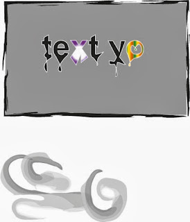
Today I worked with illustrator which is the program I will use on my final magazine for the masthead and some text. As it was my first time ever using illustrator, I had some difficulty but as I went on it became much easier to work with. Here is an example of some tools I tried out. I started off with a basic text box that I simply changed the colour of fill and typed in my text. I put a white outline on my text so it lifts off the background a bit more. When you use the direct tool and double click on text you can then change the shape of letters, this is where I made my text drip by stretching it and then flipping it. I also found out how to put a gradient colour effect on text which I did to the X and O. My text box looked plain therefore I found a way to put all kinds of borders on, I used the paintbrush mark effect one. With this same tool i found out that when you click off the box you can use it to actually paint with which is shown at the bottom. I still need to improve on my skills which I will carry on doing throughout.

Wednesday, 6 November 2013

Pitching to my audience with feedback!


Q: You didn't mention the layout for contents page, what would it be like/will it be inspired by MOJO?
A: I am looking at NME and MOJO for inspiration but I am mostly focusing on keeping it simple.

Q: Have you thought about your cover star?
A: Still unsure, may use one of two upcoming artist or make one up by using a student who sings.

Q: For your DPS what kind of information will you use?
A: I would like to do a interview with the cover star using a Q&A form.

Q: Do you think making the mag weekly is too much?
A: I am debating on weekly or monthly but new music is released every day and my mag has to stay on top of it.

Q: Would you make a facebook/twitter site?
A: Yes, there will be available social networks to get involved with our company as there will be a quiz in each issue.

Q: You have quite a lot of good ideas there, you mentioned fashion which you did link to music, but do you see that being equally for male and female?
A: Yes because we will include both male and female artists and look at there fashion/style to inspire both genders.


Thursday, 24 October 2013

Wednesday, 23 October 2013

Loooking At NewsStands

In ASDA this is how the music magazines stand looks. The rows overlap each other but enable the masthead to be clearly seen. It is important for stores to set up the magazines in this way so that the consumers can easily see where there particular choice of mag is placed.

Tuesday, 22 October 2013

Sunday, 20 October 2013

Wednesday, 16 October 2013

Planning!


I have stated planning my music magazine. I have decided to call it 'UFM' which stands for Upcoming Future Music. Today I was getting ideas on what my masthead should look like;


Monday, 14 October 2013

Preliminary Task; Evaluation

Preliminary Task; Evaluation

My task was to create a college magazine front page and contents in order to prepare myself for the actual task. I had to use photoshop and indesign which I have no previous practice in, meaning that the task had it's highs and lows. Overall I found my work to be quite successful with my strongest skill being photoshop to create a front page. I think that I used appropriate images for my magazine to include in the pages and I had taken a good front cover shot, therefore I have a strength in photography also. My contents page was not quite finished so it lacks in some detail as I struggled with the indesign programme a bit.

What went well in my work I think is that, I kept a consistent housestyle which included the font of text and the colour scheme of it to be the same on both pages. I successfully made my masthead go behind my model as most magazines out there today have so that the image is the focus but the reader can still recognize what mag it is. My coverlines are relevant and interesting. I have used a QR code for student easy access to the website on smart phones. I also included regular details like issue date, website and barcode. I like my page layout on both pages as it is simple but yet not boring or unorganised so it is easy on the readers eye. My contents page has a good use of columns which mean my writing is in one place and clear. Included bold page numbers in my columns so that it is visible. My contents page includes the main cover story, regular features and an exclusive which was inspired by a magazine I looked at online.

What I could improve on is getting more familiar with indesign so that I am prepared for my actual final mag. Next time I need to make my contents page more interesting by adding some borders on the pages or a background image/colour so that it is balanced with the busy front cover. I could also add some more details to my contents features of what to expect in the articles. As for my front cover, next time I need to use an image with a less busy background so that it is easier to pick out font themes and colours for my coverlines. That then means next time I can add more coverlines so that it is not too plain and more appealing for readers as it will grab attention. I do not like the colour of my masthead as it did not fit well with the colour scheme so I need to improve on being careful with colour.

Audience Feedback:

Person 1; (Front cover) The shot of the image on the front cover is very clear and fits into the educational theme of the magazine. I also like the masthead as it is large and clear and has been written in a suitable font for the target audience. The cover lines, bar code, QR code are all conventional and have been included on the front cover. The issue number and dates are conventional features and have been included. To improve you can add more cover lines and can match the colour scheme of the masthead with the cover lines.

(Contents page) I like the use of your columns, it gives it a structured look and is conventional to a contents page. You have kept the house style as the colours you had on your front cover match the colours on the contents page. I like how you have separated the different sections of the contents and the use of conventional images. To improve you can fill up the contents page more e.g. with editors letter, making the images larger etc.

Person 2; I think the consistency of the house style is very good which makes a good impression on the audience, it also shows good consistency in the contents page throughout. The cover lines are short and snappy and very suitable for a college magazine - the font also makes it standout and remains clear up throughout the cover page and contents. I like the layout of the contents as it looks well organised. Everything seems to be included. For improvements, fill up certain empty spaces.

I agree with all given feedback and will take on board everything said in order to get a successful outcome on my final task.

Wednesday, 9 October 2013

Leyton Magazine!!

 Unfinished contents page.Open to feedback.Thank you!

Thursday, 3 October 2013

Work In Progress!


Using photoshop to create my college magazine front cover.

Wednesday, 2 October 2013

Work in progress!


Starting off with photoshop on my front cover college mag. Here is my chosen medium close up.

Monday, 30 September 2013

Sunday, 22 September 2013

Evaluation..done and dusted!

Induction assignment; Evaluation

My task was on the topic of file sharing in which required me to make a page spread for a music magazine of my choice. Starting of the task I had to make several researches of what are the statistics and peoples views on file sharing. Using today's internet I had to make sure I was using reliable sites of information in order to make an article that was successful. Using a site like Wikipedia although very helpful it can be non-reliable at times due to being to edit the information. Also, I made sure to use information based on UK as anything else would be quite pointless for the viewers I'm going for. I think that however next time I need to add in some numeral statistics to back up my points which is what I did not do.

Furthermore, speaking of my viewers I decided to use the popular music magazine 'VIBE' as my choice. This magazine is for the older teen to younger adult target market in which I had to base my choice of language in. I typed in quite formal language in order to be professional, however I tried to include the audience as much as possible by using rethorical questions so that the reader feels intreged. Also, I kept my information to the point as I did not want my article to seem like it dragged on with too much information so I used my most valid and intersting points.

Using my written article on Microsoft Word it was then time for me to create my magazine spread on InDesign which is told to be a professional journalism programme that I was excited to use. After a couple of minutes using the programme I was not so much excited anymore, there were so many tools and little confusing things I could not get my head around. I did eventually get the hang of using some basic tools like creating columns that I could copy my article in and change the colour of them. I managed to use layers that enabled me to create a background colour of my whole page and then add my columns, pictures and logos ontop. But I am still not too confident with the layers and therefore next time I hope to be able to use it properly.

After my first attempt on InDesign I posted a JPEG of my draft to my blog in order to be able to see the progress and improvement of my work when it were done. This also meant I got to know how to use blogger to make my posts and then played around with some layouts for my page. I found blogger really easy to use and did not cause me any problems. With a simple click of a button I could make my posts and attach pictures to them. Eventually, when I finished my InDesign magazine pages that I made quite a change from my draft as I made it a double page due to realising my text would not all fit with images and pull quotes. I exported the file as JPEG so that I could attached it to my blog post and share with the world my final piece enabling anyone to view and comment.

I received feedback as follows: “Great! This Article has provided a sufficient amount of information about File-sharing and also is presented well. The images compliment the text. I like this”. “The layout is well presented with quotations in different fonts to seperate the text, for a magazine spread it is pretty dark”. This feedback is very helpful to me as I will know what to improve on in order for my audience to find my work appealing when I do the real thing. I agree with my feedbacks, next time I will have to be more careful with my colour choice and personally I think I need to experiment with fonts more.

Summary of what to improve:

  • Background colour
  • Fonts
  • InDesign skills – be more experimental
  • More wider researching

Evaluation!

Been slacking with my posts, so here's an update.

Last lesson that was on Thursday we learnt about the things that are usually seen on a front cover music magazine in order to make it successful. We also looked briefly the contents page and a double page spread. This is all in order to help out with my own pieces that I will be creating for my coursework.

Currently I am writing up my evaluation on my induction piece of a double page spread on file sharing.

Thursday, 19 September 2013

TimeToast!

Starting my Media Studies coursework with a timeline of things to have completed by when in order to stay on top of things and organised. Used the TimeToast website to create something as follows:


Wednesday, 18 September 2013

Hey Guys!! Induction piece final.


My magazine double page spread on file sharing is now complete. It wasn't easy using the programme but I managed to get round it and this is the outcome!

Tell me what you think! Open to feedback.

Monday, 16 September 2013

Magazine Page On File Sharing.

This is my draft of my magazine page.

Welcome!!

Hi Guys welcome to my Media Blog!

Here I will be sharing my daily media thoughts :)